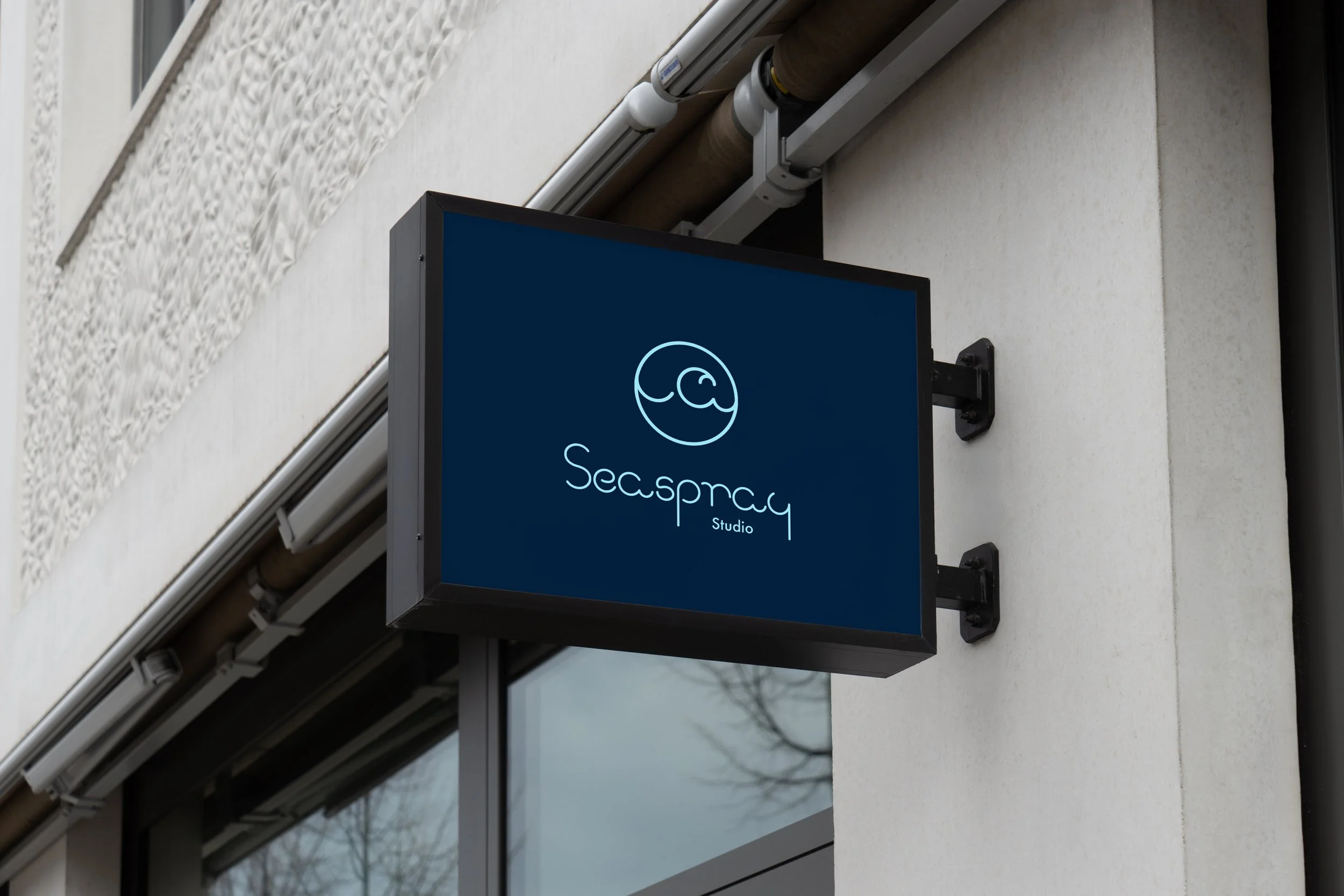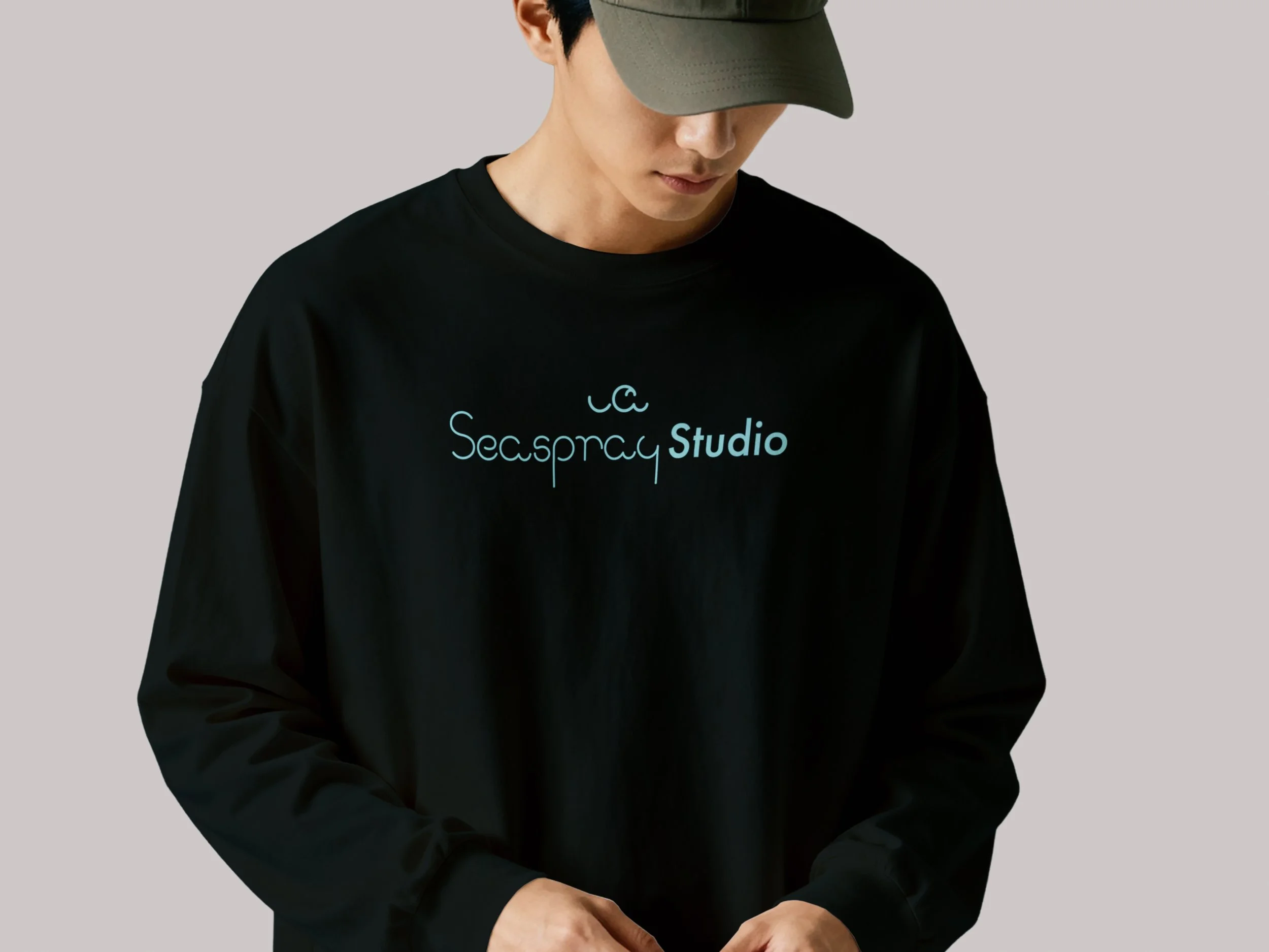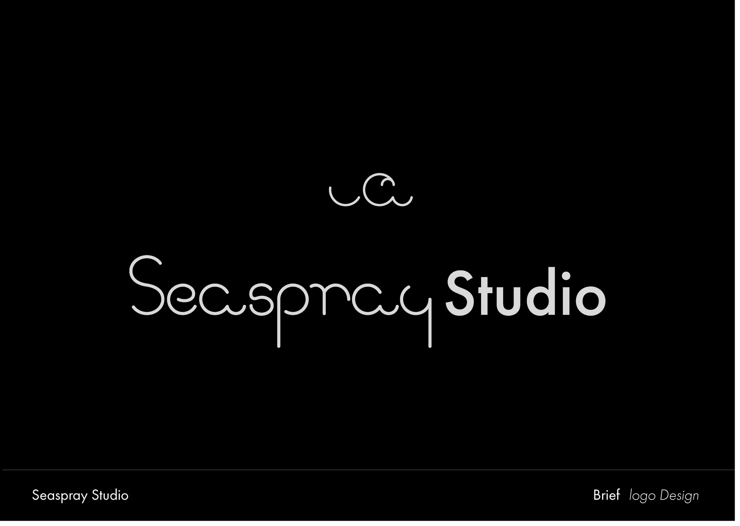
Logo and Identity
Client : Seaspray Studio
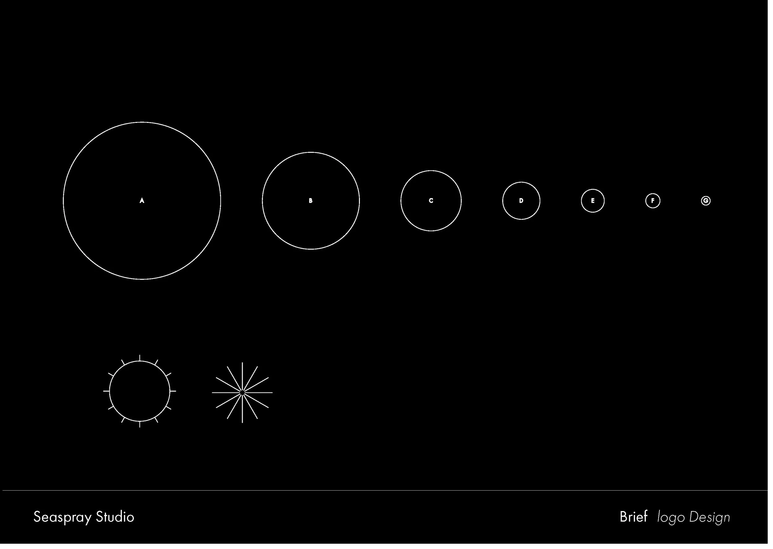
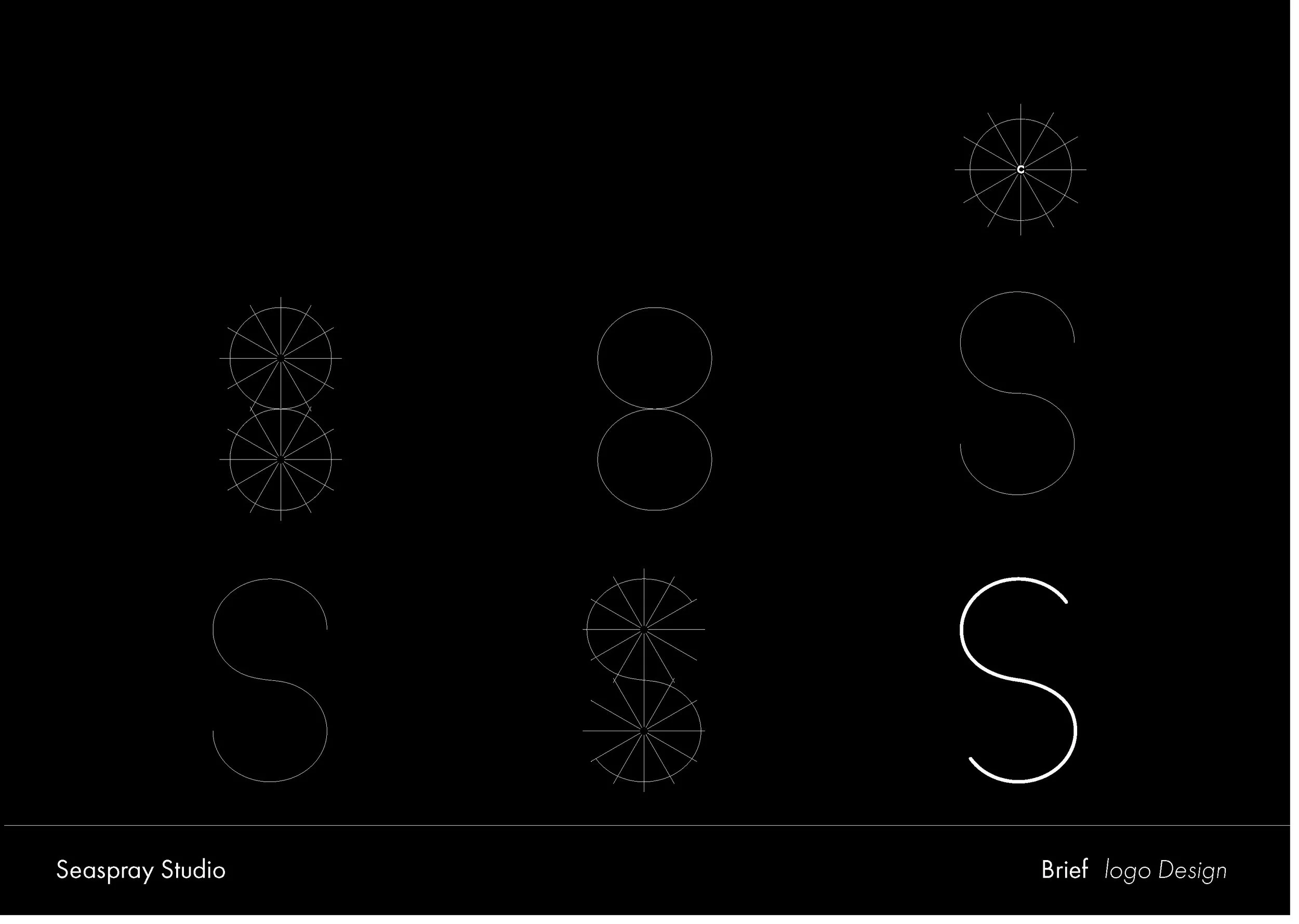
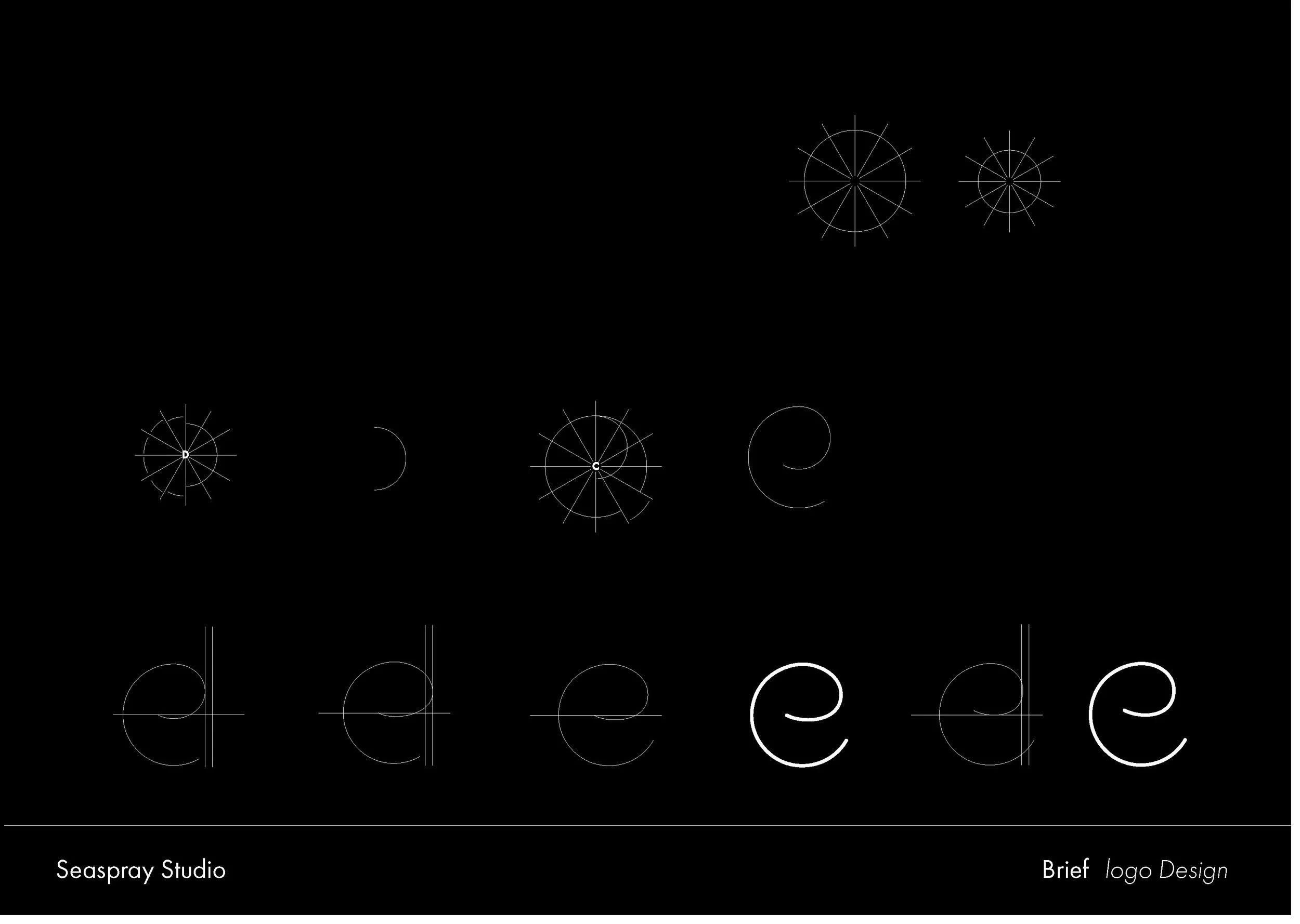
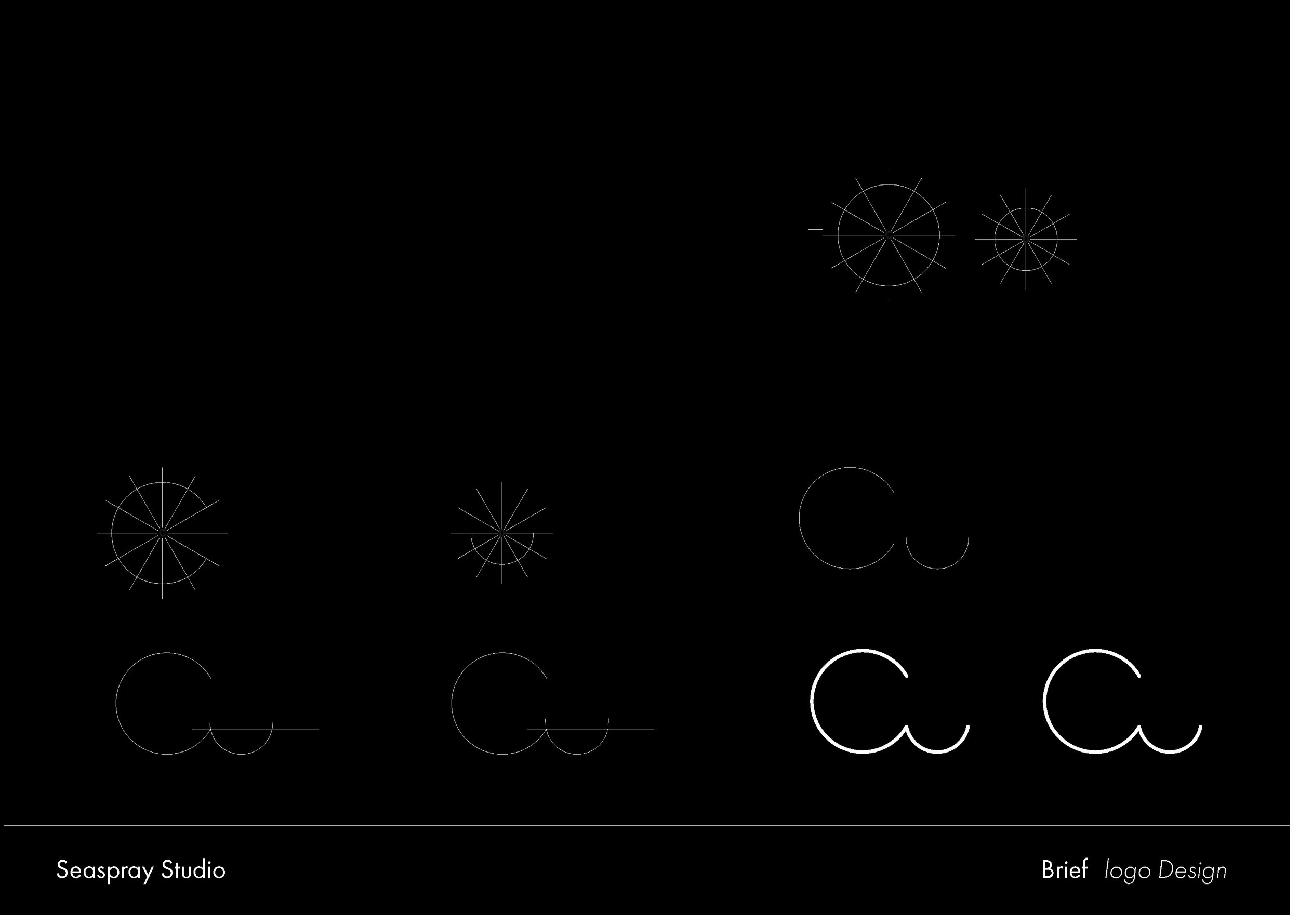
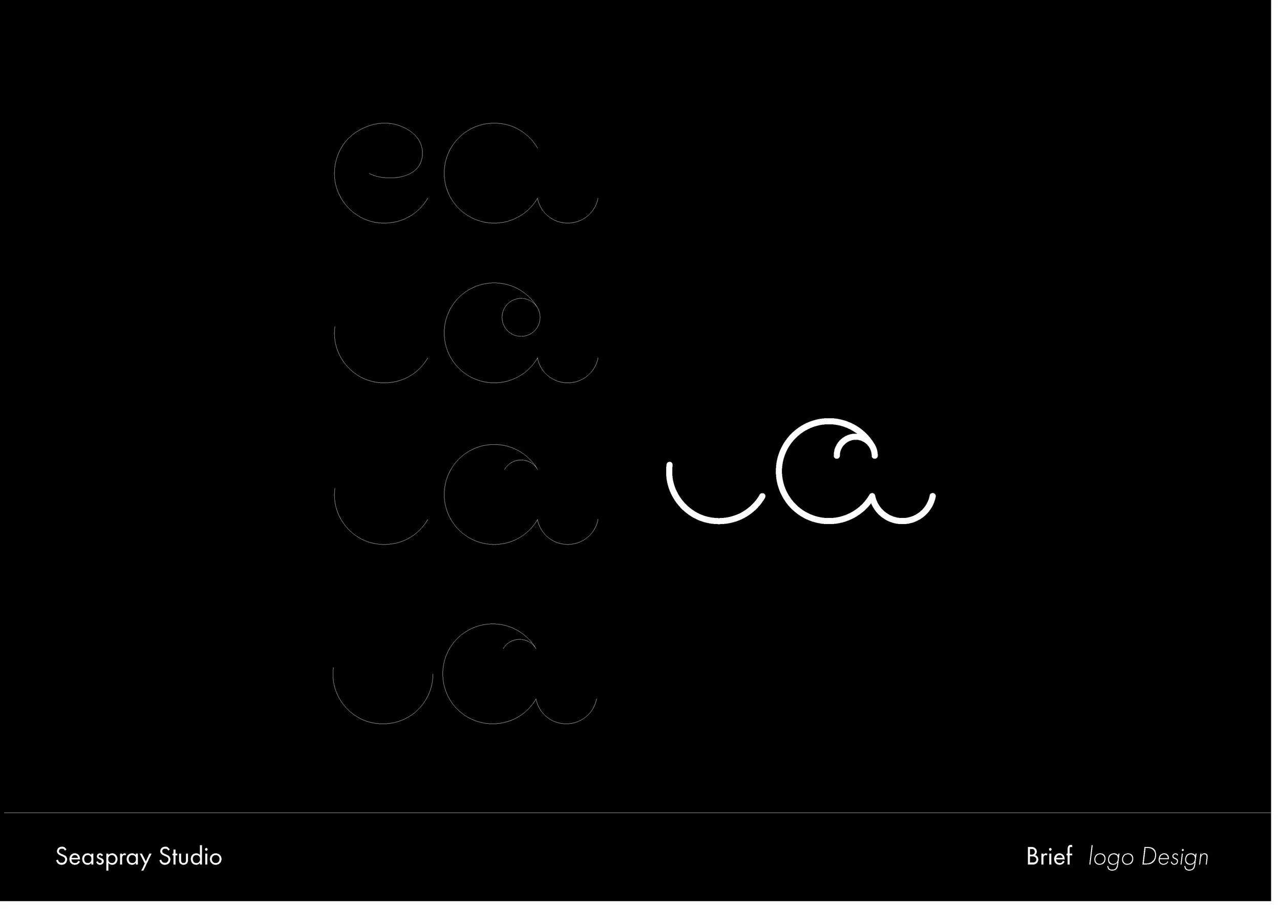
The Seaspray Studio identity started with building a custom typeface. To keep every letter consistent, each character was constructed on a circular grid, a system of radial guides that governed the proportions, curves, and stroke weights throughout the font.
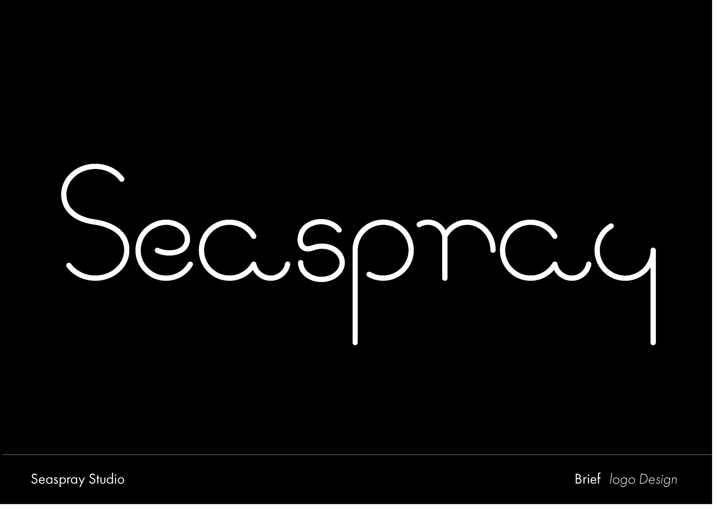
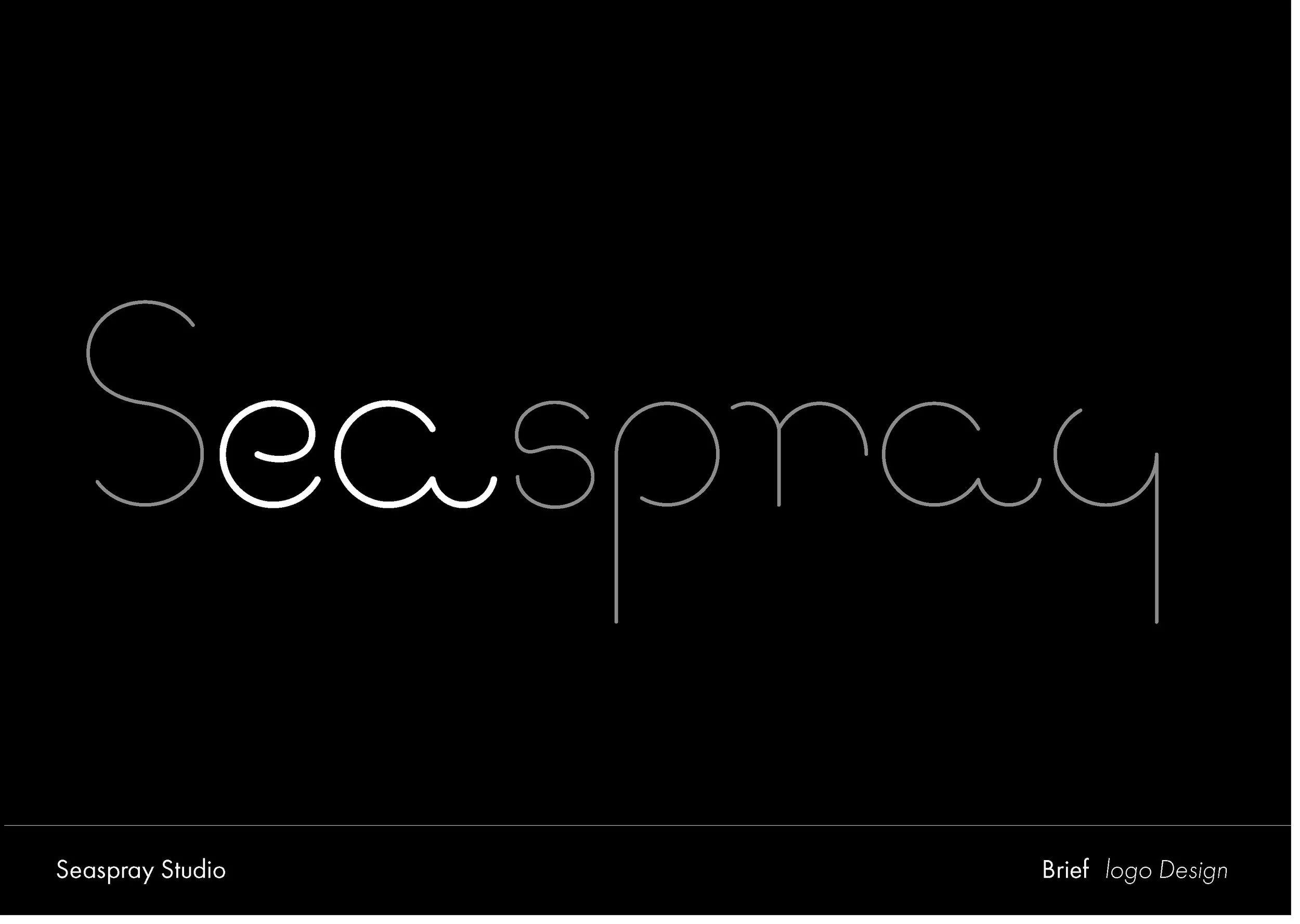
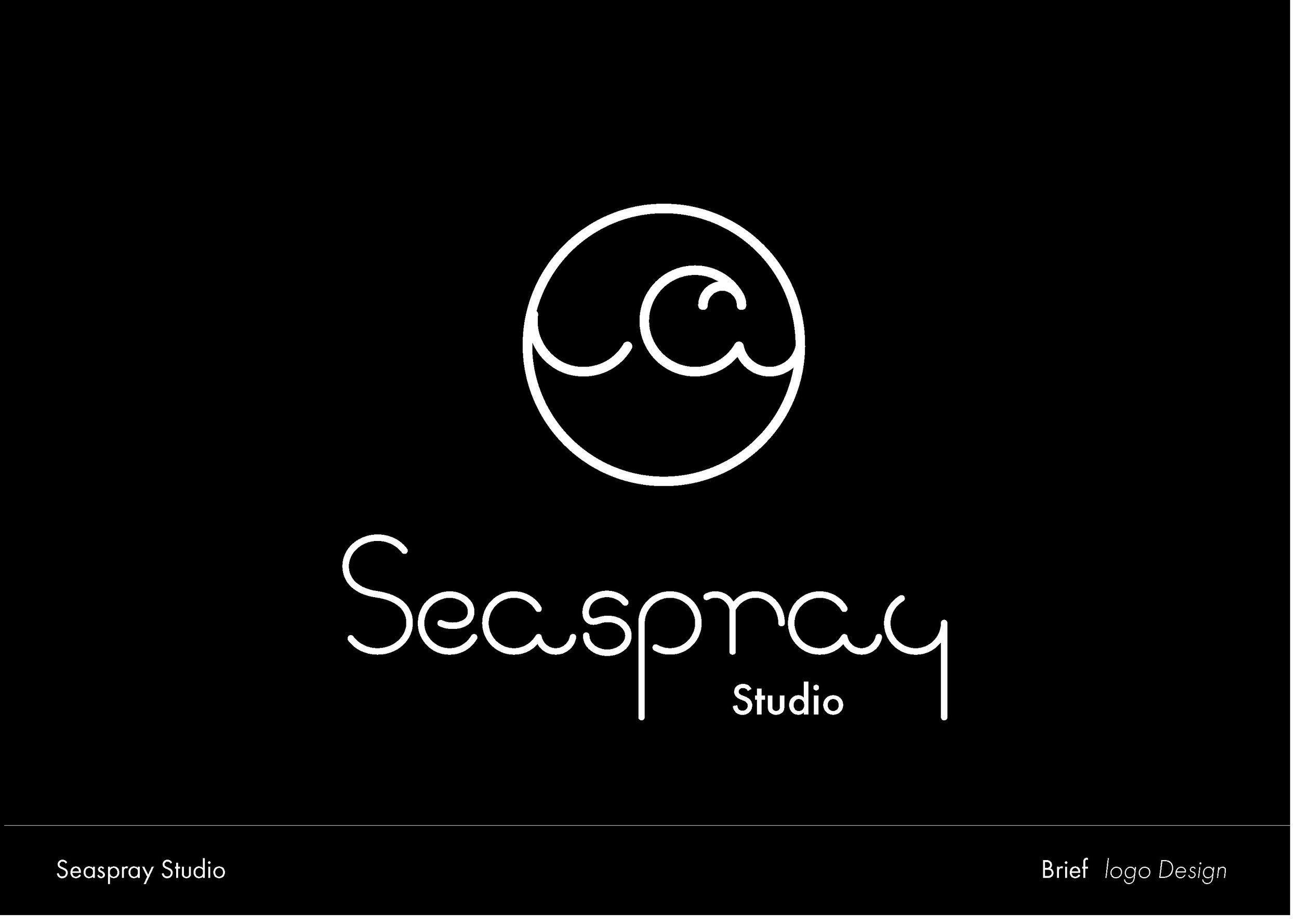
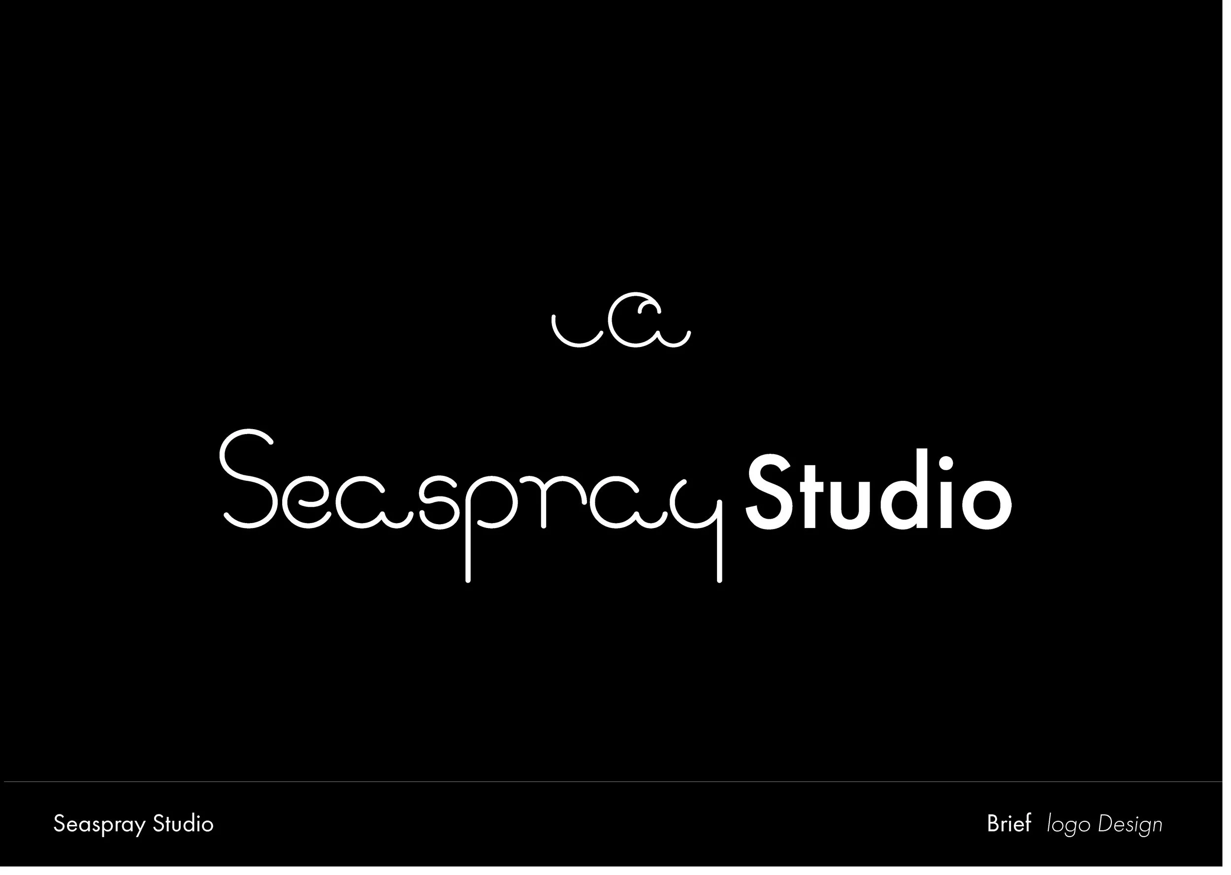
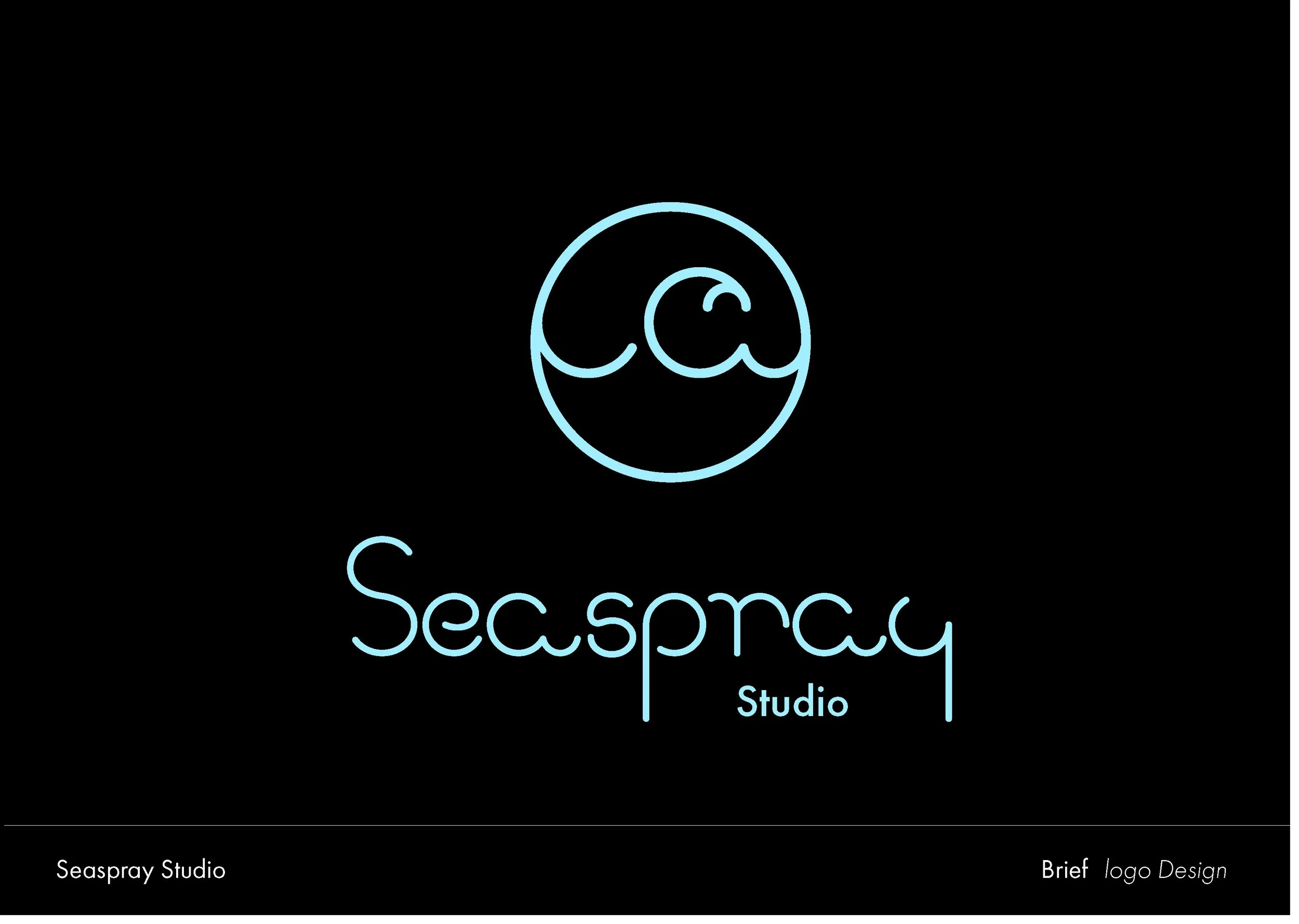
The wave came out of the typesetting process. When the letters e and a were placed in close proximity, the curl at the end of the e and the arch of the a together created a natural wave-like form. a detail that became the foundation of the logo mark. The rounded quality of the typeface was also a deliberate choice, reflecting the studio's working style: friendly, collaborative, and easy-going.